
style component는 CSS를 더욱 손쉽게 사용하는 방법입니다.
npm install --save styled-components
React에 styled-compoents를 설치합니다.
import styled from "styled-components";

const Circle = styled.div`
  width: 100px;
  height: 100px;
  background: papayawhip;
  border-radius: 50%;
`;


function App() {
  return (
    <div className="App">
      <Circle></Circle>
    </div>
  );
}

export default App;

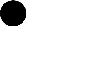
App 상단에 Circle 이라는 style component를 생성해 줍니다.
Circle은 div tag에 CSS style을 입힌 컴포넌트입니다.
사진과 같이 웹페이지 상단에 Circle이 생성된 것을 볼 수 있습니다.
styled component에 props 넘기기
styled component에 props를 전달하는 것이 가능합니다.
background color를 useState에 선언한 후 Circle에 전달하여 CSS를 설정할 수 있습니다.
import { useState } from "react";
import styled from "styled-components";

const Circle = styled.div`
  width: 100px;
  height: 100px;
  background: ${(props) => props.circleColor};
  border-radius: 50%;
`;

function App() {
  const [color, setColor] = useState("black");
  // styled component에 전달할 color의 값

  return (
    <div className="App">
      <Circle circleColor={color}></Circle>
      // color값을 props로 전달한다.
    </div>
  );
}

export default App;
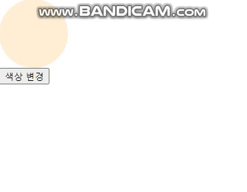
setColor 함수를 통해 color state를 변경한다면 Circle에 적용되는 CSS를 실시간으로 변경할 수 있습니다.
setColor를 변경하는 button을 만들어 봅시다.
import { useState } from "react";
import styled from "styled-components";

const Circle = styled.div`
  width: 100px;
  height: 100px;
  background: ${(props) => (props.$color ? "black" : "papayawhip")};
  border-radius: 50%;
`;

function App() {
  const [color, setColor] = useState(true);

  return (
    <div className="App">
      <Circle $color={color}></Circle>
      <button onClick={() => setColor((prev) => !prev)}>색상 변경</button>
    </div>
  );
}

export default App;
'React' 카테고리의 다른 글
| [React] 라이브러리 없이 캐러셀 만들기 (0) | 2023.03.18 |
|---|---|
| [React] Style component 오류 (0) | 2023.03.14 |
| [React] mui bottom navigation 적용 및 Error 해결 (0) | 2023.02.11 |
| [React] Uncaught ReferenceError: Cannot access 'x' before initialization (0) | 2023.02.09 |
| [React] useform + yup 을 활용한 회원가입 form 만들기 (0) | 2023.02.08 |